Choosing the perfect color scheme will go a long way toward making your house feel like the home of your dreams. However, if you have ever visited the paint section at a home improvement store, you know that when it comes to interior paint colors, the options are practically endless. Learning a few simple facts about the science of colors in interior design can make the whole process much simpler.
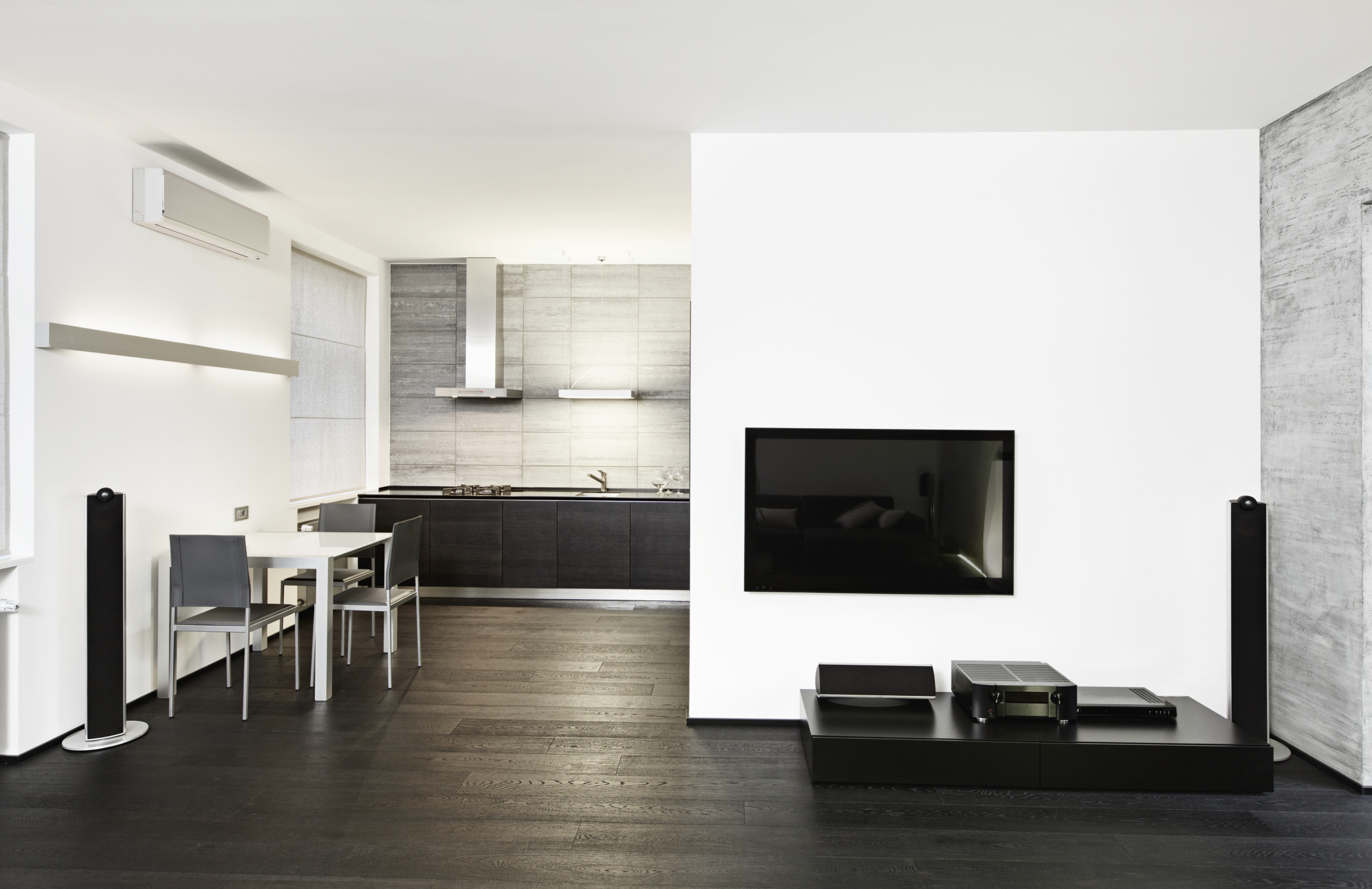
It is widely understood that color has a psychological effect on us. Both our mood and energy level can be impacted by the colors in our surroundings. As we learn more about the science of colors, we can take into consideration the concept of color meanings in interior design as well. For example, white often makes us think of order and cleanliness while black creates a sense of boldness.

It all begins with the color wheel, a powerful tool for understanding colors—how they are related to each other and how they can be best paired for the most pleasing effect. A basic color wheel is a twelve slice pie, with the colors arranged in the following order: yellow, yellow-orange, orange, red-orange, red, red-purple, purple, blue-purple, blue, blue-green, green, and yellow-green.
Below are three simple ways to use the color wheel to select the perfect color scheme:
Monochromatic

The simplest color scheme is monochromatic – or based on varying shades of the same color, ranging from light to dark. If you are looking to promote a sense of serenity and peacefulness in your room, consider a range of blues. For a more vibrant, energetic atmosphere, go with a choice of reds or oranges.
Analogous

For another simple design option, try widening your color scheme to include analogous colors, which are those that lie next to each other on the color wheel. Consider pairing a nice relaxing green with a cheerful yellow and a blended yellow-green. Analogous colors tend to combine well together, creating an overall sensation of comfort and contentment.
Complementary

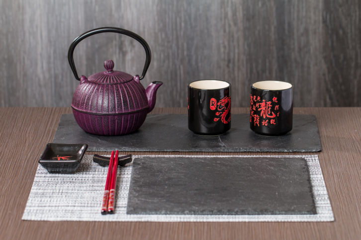
If you are feeling brave, you can make the leap to complementary colors. When you look at a color wheel, a color’s complement will be found exactly opposite on the wheel. Purple, associated with richness and opulence, can be paired with its complement, yellow, which encourages a sense of optimism. Together the contrasting hues of complementary colors tend to invoke a sense of energy and vitality in a room.
Remember that before you rush out the paint store, you should take a moment to consider the science of colors in interior design. Thoughtfully select the type of energy you want your room to inspire and then choose a color scheme that will best create that effect.
